Bruta Woodcut
TrueTypeBezplatný
- Akcenty (částečné)
- Akcenty (plné)
- Euro
Bruta_Woodcut.ttf
Tagy
>Poznámka autora
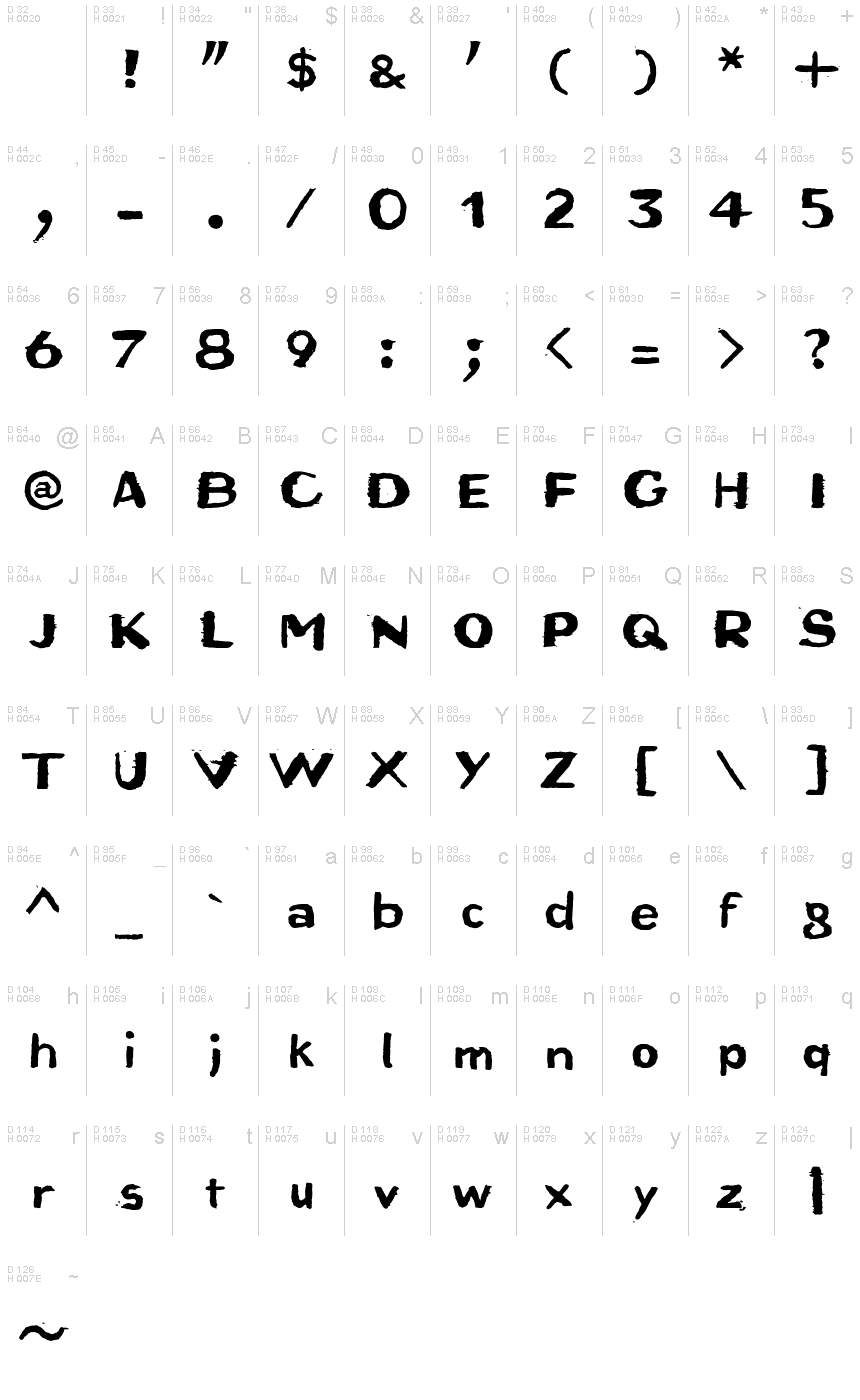
Bruta Woodcut font is an eroded display font designed by Ingo Zimmermann.
An alphabet originally carved in wood
The German term for characters or letters is Buchstaben, literally Buche (beech) and Stab (rod or stick), and dates back to the Germanic custom of carving runic characters in beechwood sticks. On New Years Eve, 2014, I used the occasion to cut real beech characters myself. I carved all the characters of this font in woodcarving manner, without tracing and mirror-inverted, in smoothly planed beech rods. After printing on paper, the digital font you see here was created from the negative typeface.
Originally planning an alphabet of capital letters only, I ended up carving figures, punctuation marks and lower case letters after all. The capital letters emphasize alternation between bold and fine strokes, which is familiar in Roman typefaces. In this way, the upper case text in Bruta Woodcut obtains its very own aesthetics.
The ductus on the lower case letters is plainly not as distinct. They look more like a classical sans serif, which becomes clear as the smaller a text is set in Bruta Woodcut, the more legible it becomes.
The original image was negative. In contrast, the font consists of the positive typeface. Bruta Woodcut includes lots of ligatures and stylistic alternates for some symbols.
Thanks to OpenType and Unicode, Bruta Woodcut supports all Western European languages plus Central and Eastern European languages as well as Turkish.
>Tabulka znaků
Prosím, použijte roletové menu ke shlédnutí různých tabulek znaků obsažených v tomto písmu.

Základní informace o písmu
Informace o autorských právech
Copyright (c) 2015 by Ingo Zimmermann. All rights reserved.
Rodina písma
Bruta
Podrodina písma
Woodcut
Jednoznačné označení podrodiny
IngoZimmermann: Bruta Woodcut: 2015
Celý název písma
Bruta Woodcut
Verze tabulky názvu
Version 1.007
Postscriptový název písma
Bruta-Woodcut
Informace o ochranné značce
Bruta Woodcut is a trademark of Ingo Zimmermann.
Výrobce
Designer
Popis
Copyright (c) 2015 by Ingo Zimmermann. All rights reserved.
Rozšířené informace o písmu
Podporované platformy
PlatformaKódování
UnicodeUnikód 2.0 a následná sémantika, jen BMP Unicode
MacintoshZápadní (roman)
MicrosoftPouze BMP Unicode
Podrobnosti o písmu
Vytvořeno2015-01-06
Revize1
Počet znaků364
Jednotek na Em1000
Práva pro vkládáníVložení pro trvalou instalaci
Rodinná třídaVolné patky
VáhaTučné
ŠířkaStředně široké
Mac styleTučné
SměrJen znaky směrovány zleva doprava + obsahují neutrály
VzorekNormální
VelikostRůzná
