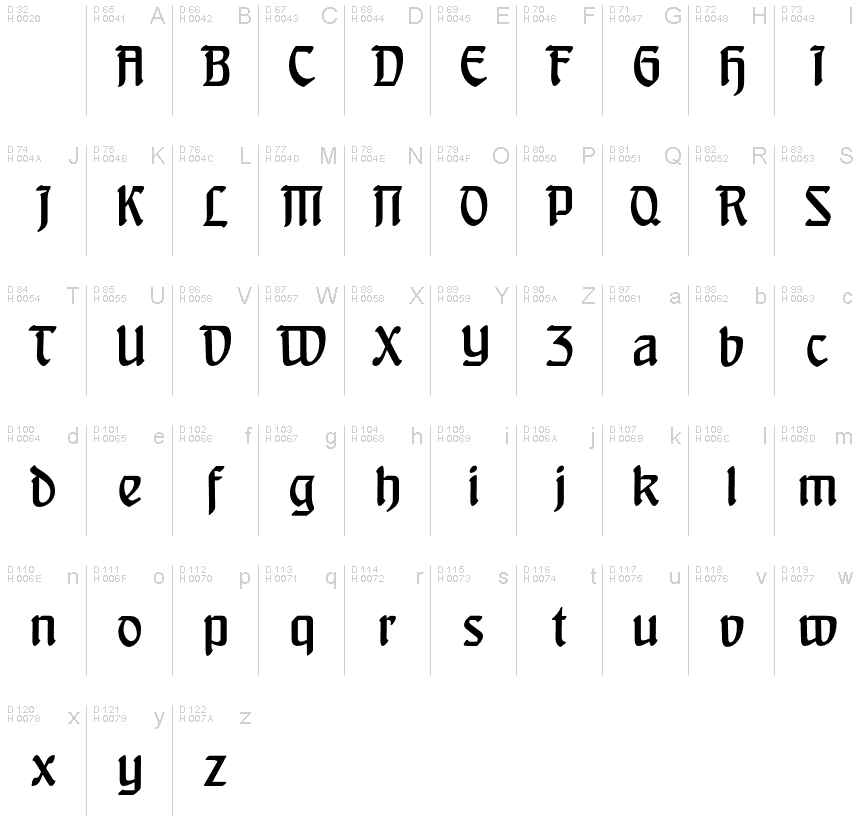
BehrensSchrift-Normalreduced
OpenTypeOsobní použití
BehrensSchrift_Normal.otf
Tagy
>Poznámka autora
Behrens Schrift Normal Reduced, designed by ingoFonts, is a stunning gothic font with a semi-light weight that exudes elegance and sophistication. Its unique design features intricate details and bold lines that make it perfect for projects requiring a touch of old-world charm. This font style is especially suitable for invitations, book covers, and branding materials that aim to convey an air of mystery and refinement. Its reduced width also makes it ideal for headings or subheadings in lengthy documents or presentations where space is limited. Behrens Schrift Normal Reduced is sure to captivate any audience with its timeless appeal and exquisite craftsmanship.
Peter Behrens renowned art nouveau type from 1902 with ornaments. Newly revised and neatly digitalized
In 1902, Peter Behrens (18691940), architect, designer and typographer, created a new German type which became very successful very quickly for the Rudhardsche Gieerei (foundry which later became Gebr. Klingspor AG) in Offenbach am Main. It served, for example, as the official German type for the world expositions in 1904 and 1910.
Behrens himself writes about the development of this type ...For the actual form of my type, I took the technical principle of the Gothic script, the stroke of the quill feather. The proportions of height and width and the boldness of the strokes of the Gothic letters were also decisive for me in producing a German character. A cohesive character could be hoped for by avoiding all non-necessities and by strictly carrying out the design principle of holding the quill at an angle *
Behrens Typeface is still sought after as is proven, at the very least, by a few poorly digitalized free fonts which can be found on the WWW.
A project about the modern use of historical industrial buildings in Germany motivated me to take a closer look at the work of Peter Behrens. With the type of Peter Behrens, the ideal display type exists; unfortunately, it can only be found in an absolutely unacceptable quality.
Even D. Stempel GmbH, which still today casts the types of the former Gebr. Klingspor AG (formerly Rudhardsche Gieerei) for manual typesetting, shows in a digitalized specimen sheet of typefaces a neat version of the Behrens Typeface, but still not one which meets todays quality standards. Reason enough for ingoFonts to create the perfect Behrens Typeface.
Voil here it is: the new, revised, original Behrens Typeface from 1902, first newly and neatly drawn and digitalized in detail, and then expanded for all European languages with the Latin font system.
>Tabulka znaků
Prosím, použijte roletové menu ke shlédnutí různých tabulek znaků obsažených v tomto písmu.

Základní informace o písmu
Informace o autorských právech
Copyright (c) 2008 by Ingo Zimmermann. All rights reserved.
Rodina písma
BehrensSchrift
Podrodina písma
Normal reduced
Jednoznačné označení podrodiny
PeterBehrens1902,IngoZimmermann2008: Behrens-Schrift: 2008
Celý název písma
BehrensSchrift-Normalreduced
Verze tabulky názvu
Version 2.003
Postscriptový název písma
BehrensSchrift-Normalreduced
Informace o ochranné značce
Behrens-Schrift is a trademark of Ingo Zimmermann 2008.
Výrobce
Designer
Popis
Copyright (c) 2008 by Ingo Zimmermann. All rights reserved.
Rozšířené informace o písmu
Podporované platformy
PlatformaKódování
UnicodeUnikód 2.0 a následná sémantika, jen BMP Unicode
MacintoshZápadní (roman)
MicrosoftPouze BMP Unicode
Podrobnosti o písmu
Vytvořeno2009-10-26
Revize2
Počet znaků53
Jednotek na Em1000
Práva pro vkládáníVložení pro trvalou instalaci
Rodinná třídaBez klasifikace
VáhaStředně tenké
ŠířkaStředné (normální)
Mac styleTučné
SměrJen znaky směrovány zleva doprava + obsahují neutrály
VzorekNormální
Úplný balíček obsahuje 4 vah písma, uvedených níže:
BehrensSchrift_Normal.otf
Behrensschrift.ttf
BehrensSchrift_Schmuck.otf
BehrensSchrift_Licht.otf
Behrensschrift.ttf
BehrensSchrift_Schmuck.otf
BehrensSchrift_Licht.otf
Behrensschrift
TrueTypeBezplatný
BehrensSchrift-Schmuckreduced
OpenTypeOsobní použití
BehrensSchrift-Lichtreduced
OpenTypeOsobní použití
