Conradi Square
TrueTypeBezplatný
- Akcenty (částečné)
- Euro
conradi_square.ttf
Tagy
>Poznámka autora
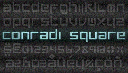
A square, "uncial" font, inspired by a friends' surname and the Carhartt t-shirts that were fashionable half a decade ago. (This text is written in 2014) It's suited best for single-word captions. It has a very complete character set, with many diacritis included, as well as a the euro, pound, yen and dollar sign.
The font has only lower case characters, the uppercase characters being either copies of or variants on (F, L, K, O, V, X, Z) their lower case counterparts. Every character tries to fill up a perfect sqaure (a, b, c, e, m, n, o, r, s, u, v, w, x, z) and tries to use only horizontal and vertical lines. If that's not possible, 45 degree angles are used (k, v and 'capital' z). Ofcourse, being a true lower-case font, ascenders and descenders are used wherever needed.
In this typeface, no intersections have been allowed. Hence, characters like 'x' and '+' make use of 'fly-overs' or 'pylons'. For the 'o', this forced me to make two variants: one that is continuous and one with two 'pylons'. Ciphers are slightly smaller then characters. The German ringel-s () does right to it's origin as a ligature: it's a combination of a slender and low 's'. I could not resist including a Danish/Norwegian .
This font is very suitable to be a used as a stencil. (Just select the right 'o' by using the uppercase variant.)
Free for any use, but if you use it, I would appreciate an e-mail.
FontForge was used to create most diacritics and to export it to a TTF.
By: IDEOGRAM (www.ideogram.nl)
http://www.ideogram.nl/content/conradi-font
>Tabulka znaků
Prosím, použijte roletové menu ke shlédnutí různých tabulek znaků obsažených v tomto písmu.

Základní informace o písmu
Rodina písma
Conradi
Podrodina písma
Medium
Celý název písma
Conradi Square
Verze tabulky názvu
Version
Postscriptový název písma
conradi_square
Rozšířené informace o písmu
Podporované platformy
PlatformaKódování
UnicodeUnikód 2.0 a následná sémantika, jen BMP Unicode
MacintoshZápadní (roman)
MicrosoftPouze BMP Unicode
Podrobnosti o písmu
Vytvořeno2012-09-08
Revize1
Počet znaků179
Jednotek na Em115
Práva pro vkládáníVložení povoleno pro editování (změnu)
Rodinná třídaBez klasifikace
VáhaStředně tenké
ŠířkaŠiroké
Mac styleTučné
SměrJen znaky směrovány zleva doprava + obsahují neutrály
VzorekNormální
VelikostRůzná