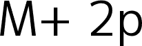
Duru Sans by Onur Yazicigil of Sorkin Type Co. is a free humanist sans serif with open proportions. Even strokes and gently shaped joins keep the letters from feeling mechanical. The broad curves look especially relaxed.
Its calm structure suits cultural posters and wayfinding, offering clarity without an industrial edge. Soft curves also fit museum branding and understated packaging aimed at an approachable audience. In editorial design, it provides a measured voice for section headings and magazine cover lines.
Duru is low contrast a classic 20th century style sans design. Duru is a new take on mixing the humanist urge with the modernist one.ÊDuru also somehow manages to be elegant and a workhorse type at the same time. Duru can be used at a wide range ofÊsizes.
Rozšířené informace o písmu
Podporované platformy
PlatformaKódování
UnicodeUnikód 2.0 a následná sémantika, jen BMP Unicode
MacintoshZápadní (roman)
MicrosoftPouze BMP Unicode
Podrobnosti písma
Vytvořeno2011-12-17
Revize1
Počet glyfů425
Jednotek na em2048
Práva k vloženíVložení pro trvalou instalaci
Třída rodinyBezpatkové
TloušťkaStředně tenké
ŠířkaStředné (normální)
Styl MacTučné
SměrJen znaky směrovány zleva doprava + obsahují neutrály