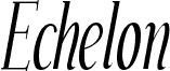
Echelon by Ray Larabie of Typodermic Fonts Inc. is a free high-contrast serif font with exceptionally tall, narrow proportions. Its hairline strokes meet broad verticals in dramatic fashion, and many letters finish in long, taut curves. The overall silhouette is poised and unmistakably elegant.
Fashion photography and slender architectural imagery echo its elongated shapes, making it well suited to magazine covers and luxury campaigns. Perfume packaging is another convincing setting because the fine details suggest delicacy without looking fragile. In event posters, the lettering can become part of a decorative frame or monogram rather than serving as neutral text.
--
Echelon was created in late 1999 using vector-editing software on a Palm computer. To the creator’s recollection, it is the only font they designed using software other than Fontographer or FontLab. Almost all of Echelon’s characters were developed during a return flight between Toronto and Seattle. The creator entered it into a font contest and won FontLab, which they still use. Echelon was later revised to support more languages and include additional punctuation and mathematical symbols. It remains free.
The fonts include a license allowing free commercial use, sometimes referred to as a desktop license. This permits you to install the fonts on a computer and use them to create finished artwork. See the license agreement for details.
Embedding the fonts in an app, ebook, or website, or using them in any way not covered by the desktop license agreement, requires a different type of license. Distributors offering different licenses are available at the following URL, or you can contact the creator for assistance.
https://typodermicfonts.com/echelon-the-sky-font/