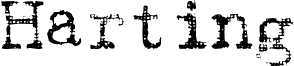
Gabriele Light Ribbon FG, based on D. Rakowski's Harting, is a free eroded display font with tall, upright slab-serif letters and a distinctly weathered surface. Broad, sturdy outlines are interrupted by clusters of round pinholes, ragged edges, and larger missing patches, producing a densely mottled texture that feels more decorative than merely distressed.
Posters are its most convincing setting. The unusual perforation also suits album artwork and festival graphics rooted in vintage print, sideshow ephemera, or handmade collage, and on magazine and book covers it can turn a title into part of the printed texture rather than neutral lettering.
Gabriele was the name of his granddaughter. In 1957 Max Grundig, German industrialist, bought the two companies Triumph and Adler and merged them into his office machine label 'Triumph Adler'. Thus, 'Gabriele' became the name of a popular series of typewriters in postwar Germany.
We have chosen this name for our series of typewriter fonts in reminiscence of those machines and all the ladies (called Gabriele or not) that used to type on them from the 1950s to the '80s.
The Ribbon members of the Gabriele are based on the Dave-Rakowski font "Harting". You can see the texture of the ribbon in each letter. There is a darker companion font "Gabriele Dark Ribbon FG". This is a monospaced font. The characters have all the same width - with the exception of the "ellipsis" character ("...") which is of course three spaces wide. Naturally, these fonts have and need no kerning.
Rozšířené informace o písmu
Podporované platformy
PlatformaKódování
UnicodeUnicode 1.0 sémantika
MacintoshZápadní (roman)
MicrosoftPouze BMP Unicode
Podrobnosti písma
Vytvořeno2013-05-19
Revize1
Počet glyfů271
Jednotek na em2048
Práva k vloženíVložení pro trvalou instalaci
Třída rodinyVolné patky
TloušťkaStředné (normální)
ŠířkaStředné (normální)
Typ šířkyNormální
Styl MacTučné
SměrJen znaky směrovány zleva doprava + obsahují neutrály