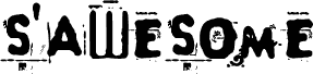
Linkin je bezplatné japonské display písmo postavené na těžkých, blokových tazích a ostrých řezech, které dávají písmenům kompaktní, městský nádech. Abeceda kombinuje širokou horizontální váhu se zaoblenými háčky a useknutými rohy, takže působí spíše jako nápisy a logotypy z éry videoher než jako uhlazené geometrické písmo.
Díky tomu je tento bezplatný font přirozenou volbou pro plakáty, streetwearovou grafiku, hudební obaly, titulky a výrazné značky, kde písmena sama o sobě nesou silnou vizuální atmosféru. Skvěle funguje i pro krátké nadpisy nebo monogramy, protože velká písmena do sebe zapadají a vytvářejí mohutné siluety s nezaměnitelným japonským rytmem.
Monotype Type Drawing Office - Robin Nicholas, Patricia Saunders 1982
Popis
Contemporary sans serif design, Arial contains more humanist characteristics than many of its predecessors and as such is more in tune with the mood of the last decades of the twentieth century. The overall treatment of curves is softer and fuller than in most industrial style sans serif faces. Terminal strokes are cut on the diagonal which helps to give the face a less mechanical appearance. Arial is an extremely versatile family of typefaces which can be used with equal success for text setting in reports, presentations, magazines etc, and for display use in newspapers, advertising and promotions.