Oxford Street
TrueTypeOsobní použití
- Akcenty (částečné)
- Akcenty (plné)
- Euro
OxfordStreet.ttf
Tagy
>Poznámka autora
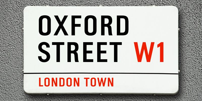
K-Type Oxford Street is a signage font that began as a redrawing of the capital letters used for street nameplates in the borough of Westminster in Central London.
The nameplates were designed in 1967 by the Design Research Unit using custom lettering based on Adrian Frutigers Univers typeface, a curious combination of Univers 69 Bold Ultra Condensed, a weight that doesnt seem to exist but which would flatten the long curves of glyphs such as O, C and D, and Universe 67 Bold Condensed with its more rounded lobes on glyphs like B, P and R.
Letters were then remodelled to improve their use on street signs. Thin strokes like the inner diagonals of M and N were thickened to create a more monolinear alphabet; the high interior apexes were lowered and the wide joins thinned. The crossbar of the A was lowered, the K was made double junction, and the tail of the Q was given a baseline curve.
K-Type Oxford Street continues the process of impertinent improvement and includes myriad minor adjustments and several more conspicuous amendments. The stroke junctions of M and N are further narrowed and their interior apexes modified. The middle apex of the W is narrowed and the glyph is a little more condensed. The C and S are drawn more open, terminals slightly shortened.
The K-Type font adds a new lowercase which is also made more monolinear so better suited to signage, loosely based on Univers but also taking inspiration from the Transport typeface both in a taller x-height and character formation. The lowercase L has a curled foot, the k is double junctioned to match the uppercase, and terminals of a, c, e, g and s are drawn shorter for openness and clarity.
A full repertoire of Latin Extended-A characters features low-rise diacritics that keep congestion to a minimum in multiple lines of text.
The font tips the hat to signage history by including stylistic alternates for M, W and w that have the pointed middles of the earlier MOT street sign typeface.
Full details at https://www.k-type.com/fonts/oxford-street/
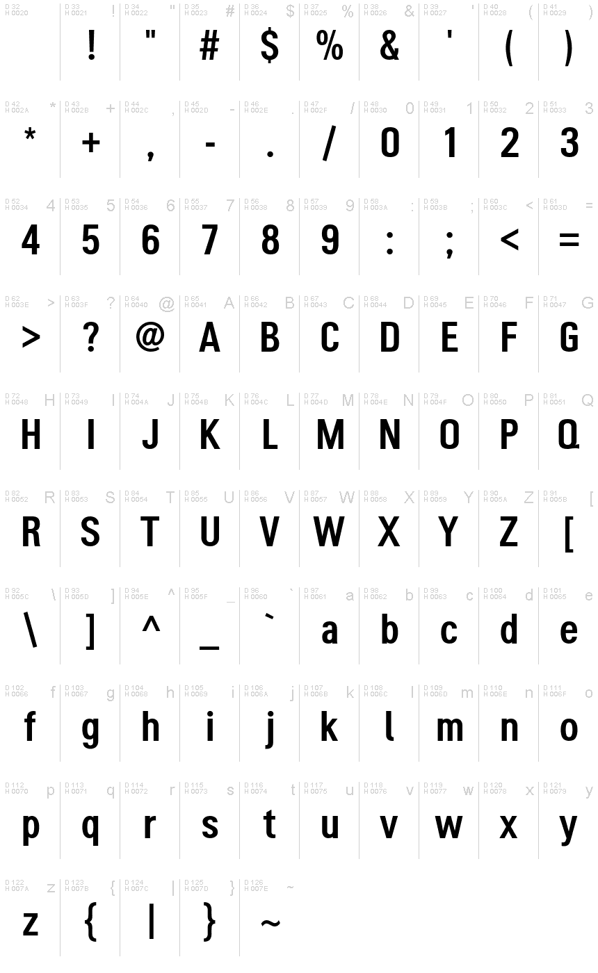
>Tabulka znaků
Prosím, použijte roletové menu ke shlédnutí různých tabulek znaků obsažených v tomto písmu.

Základní informace o písmu
Informace o autorských právech
Oxford Street by Keith Bates • © 2021 www.k-type.com • Oxford Street is a signage font that began as a redrawing of the capital letters used for street nameplates in the borough of Westminster in Central London.
Rodina písma
Oxford Street
Podrodina písma
Regular
Jednoznačné označení podrodiny
pyrs: Oxford Street: 2021
Celý název písma
Oxford Street
Verze tabulky názvu
Oxford Street version 1.0 by Keith Bates • © 2021 www.k-type.com
Postscriptový název písma
OxfordStreet
Výrobce
Designer
Keith Bates
Rozšířené informace o písmu
Podporované platformy
PlatformaKódování
UnicodeUnikód 2.0 a následná sémantika, jen BMP Unicode
MacintoshZápadní (roman)
MicrosoftPouze BMP Unicode
Podrobnosti o písmu
Vytvořeno2021-10-13
Revize1
Počet znaků408
Jednotek na Em1000
Práva pro vkládáníVložení pro trvalou instalaci
Rodinná třídaBezpatkové
VáhaStředně tenké
ŠířkaÚzké
Mac styleTučné
SměrJen znaky směrovány zleva doprava + obsahují neutrály
VzorekNormální
VelikostRůzná
