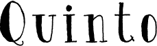
Quinto by Ewen Prigent is a free hand-drawn display serif with the uneven pressure and slightly shaky edges of inked lettering. Tall, loosely built letters mix fine strokes with sudden dark patches, giving the type a curious, storybook quality.
On book covers, the irregular forms can become part of an illustrated scene rather than sitting apart as neutral type. They also suit literary event posters, independent shop branding, and specialty packaging, where the rough ink texture can shape a memorable product identity.