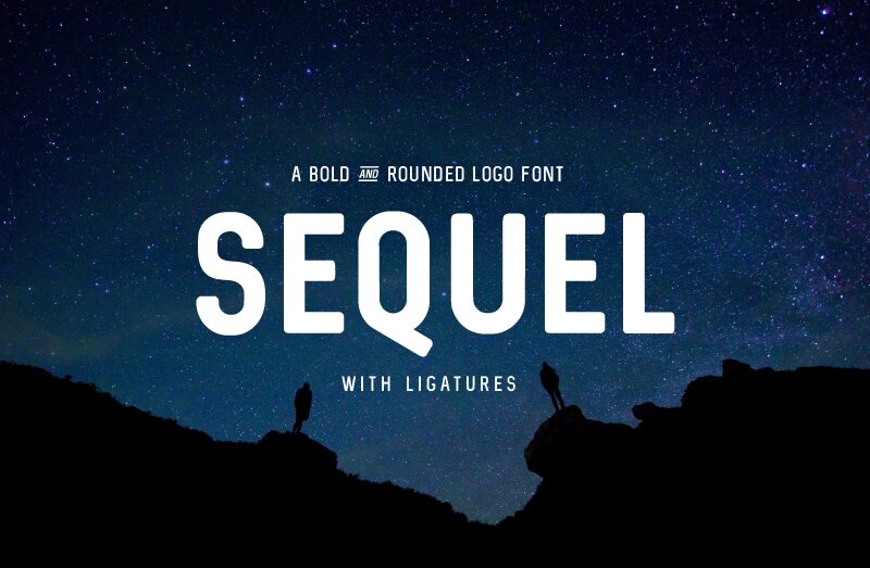
Sequel
TrueTypeOsobní použití
- Euro
Sequel_Demo.ttf
Tagy
>Poznámka autora
Sequel, crafted by the skilled hand of Philip Trautmann, stands out with its sans serif elegance and semi-bold weight, harmoniously combining contemporary flair with functional precision. The condensed width of Sequel not only offers an aesthetically pleasing tightness to text but also ensures a striking presence on the page or screen.
The font's clean lines and unembellished forms give it a modern appeal that is versatile across various mediums. From bold advertising campaigns to chic editorial layouts, Sequel’s minimalist beauty is adaptable without sacrificing personality. Whether deployed in headlines or branding projects, this font promises to deliver readability with a stylish edge.
Its suitability for digital and print mediums alike makes Sequel an asset for designers seeking a typeface that marries visual impact with practical application. The thoughtful design by Trautmann ensures that Sequel will elevate creative projects with its distinctive yet approachable character.
With "Sequel" I wanted to design a multifunctional Typeface. I created Ligatures for "The" and "of", so you just need to type 'the' or 'of" and it automatically converts it to my ligatures.
* Please note! * Sequel is free for personal use only.
To buy a standard license or get a light and italic style please visit: www.phitradesign-fonts.com
If your company has more than 10 members you will need an extended license. For that please contact me on my website www.phitradesign-fonts.com or contact me directly via email at: license@phitradesign-fonts.com
Thanks!
>Tabulka znaků
Prosím, použijte roletové menu ke shlédnutí různých tabulek znaků obsažených v tomto písmu.

Základní informace o písmu
Informace o autorských právech
Phitradesign 2016 (C) ALL RIGHTS RESERVED
Rodina písma
Sequel
Podrodina písma
Regular
Jednoznačné označení podrodiny
1.000;UKWN;Sequel-Regular
Celý název písma
Sequel
Verze tabulky názvu
Version 1.000
Postscriptový název písma
Sequel-Regular
Výrobce
Designer
Rozšířené informace o písmu
Podporované platformy
PlatformaKódování
UnicodeUnikód 2.0 a následná sémantika, jen BMP Unicode
MacintoshZápadní (roman)
MicrosoftPouze BMP Unicode
Podrobnosti o písmu
Vytvořeno2016-02-11
Revize1
Počet znaků78
Jednotek na Em4000
Práva pro vkládáníVložení povoleno pro editování (změnu)
Rodinná třídaBezpatkové
VáhaStředně tučné
ŠířkaÚzké
Mac styleTučné
SměrJen znaky směrovány zleva doprava + obsahují neutrály
VzorekNormální
VelikostRůzná
