STF_OBLONGUS
TrueTypeOsobní použití
- Akcenty (částečné)
- Euro
stf-oblongus.ttf
Tagy
>Poznámka autora
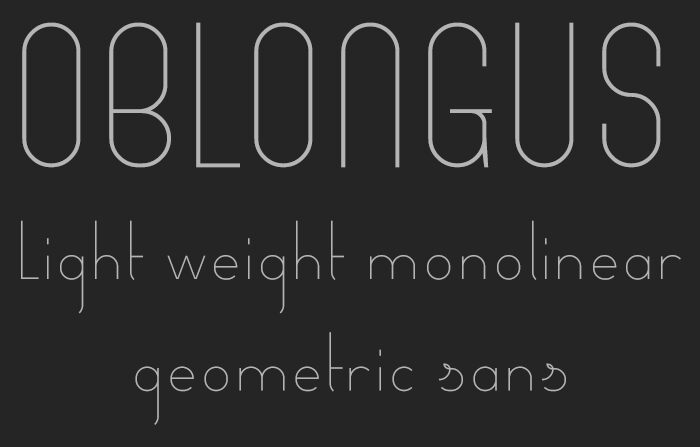
STF Oblongus, designed by Ron Ruedisueli, is an extraordinary sans serif font that exudes elegance and minimalism. With its extra-light weight and extra-condensed width, this font showcases a sleek and streamlined aesthetic that is perfect for modern and sophisticated projects. Its monolinear geometric structure adds a touch of simplicity and versatility to any design.
STF Oblongus is an ideal choice for branding materials, editorial layouts, website headers, and contemporary packaging designs. Let this font elevate your creations with its clean lines and refined appeal.
STF Oblongus is an ideal choice for branding materials, editorial layouts, website headers, and contemporary packaging designs. Let this font elevate your creations with its clean lines and refined appeal.
>Tabulka znaků
Prosím, použijte roletové menu ke shlédnutí různých tabulek znaků obsažených v tomto písmu.

Základní informace o písmu
Informace o autorských právech
Copyright Sed4tives 2022
Rodina písma
STF_OBLONGUS
Podrodina písma
Regular
Jednoznačné označení podrodiny
STF_OBLONGUS
Celý název písma
STF_OBLONGUS
Verze tabulky názvu
1.0
Postscriptový název písma
STF_OBLONGUS
Informace o ochranné značce
FontStruct is a trademark of FontStruct.com
Výrobce
Designer
Popis
“STF_OBLONGUS” was built with FontStruct
Designer description: OBLONGUS - Modern light weight geometric sans
════════════════════════
■ Description:
Light weight monolinear geometric sans.
■ Design summary:
One of the most striking features is it's overall well ventilated, light weight and spacious appearence. Some other key features are the glyph's elongated ascenders and descenders. These give the font a somewhat condensed and stretched look. An additional side effect of this is the extra empty vertical space above and bellow a line of text. Contributing even some more to the already ventilated character of the design.
Another key feature are the stylish rounded forms and novel long spurs. I tried to find elegance in it's simplicity, the decorative elements, turns and twists were all done in a very gentle but clearly present manner. All working together these elements give the font a very welcoming, friendly and laid-back vibe. Extra's, such as glyph alternatives will help spicing things up even a bit more.
So, while trying to remain simplistic in nature the font does have some nice stylistic appeal for sure.
■ Tech specs: (measured in square grid units)
Glyphs dimensions: 16 × 8
Weight: 0.125 (1/8th)
Brick size filter: 2 ꞉ 2
■ Font features:
▪ Basic-Latin, punctuation & symbols
▪ Lining & non-lining (oldstyle) numerals
▪ Glyph alternatives
▪ Partial kerning
■ Update history:
▪ [06-24-2022]
Basic font created
▪ [06-24-2022]
Changed lowecase 'w' with a wider version
▪ [06-24-2022]
Made cursive style lowercase 's' & 'tailed z' glyphs as default style
▪ [06-24-2022]
Partial kerning applied
▪ [07-24-2022]
Added multiple sets of numerals styles
- Lining (default style)
- Non-Lining (Oldstyle)
- Double Struck
(Slight different, extra decorative, more leaning towards classic style)
▪ [07-24-2022]
Included random stylistic glyph alternates, special characters & ligatures
- Additional extra characters will follow next update
I hope you like it so far
Rozšířené informace o písmu
Podporované platformy
PlatformaKódování
UnicodeUnikód 2.0 a následná sémantika, jen BMP Unicode
MacintoshZápadní (roman)
MicrosoftPouze BMP Unicode
Podrobnosti o písmu
Vytvořeno2022-08-01
Revize1
Počet znaků284
Jednotek na Em2048
Práva pro vkládáníVložení povoleno pouze pro shlédnutí a tisk
Rodinná třídaBezpatkové
VáhaVelmi tenké
ŠířkaVelmi úzké
Mac styleTučné
SměrJen znaky směrovány zleva doprava + obsahují neutrály
VzorekNormální
VelikostRůzná