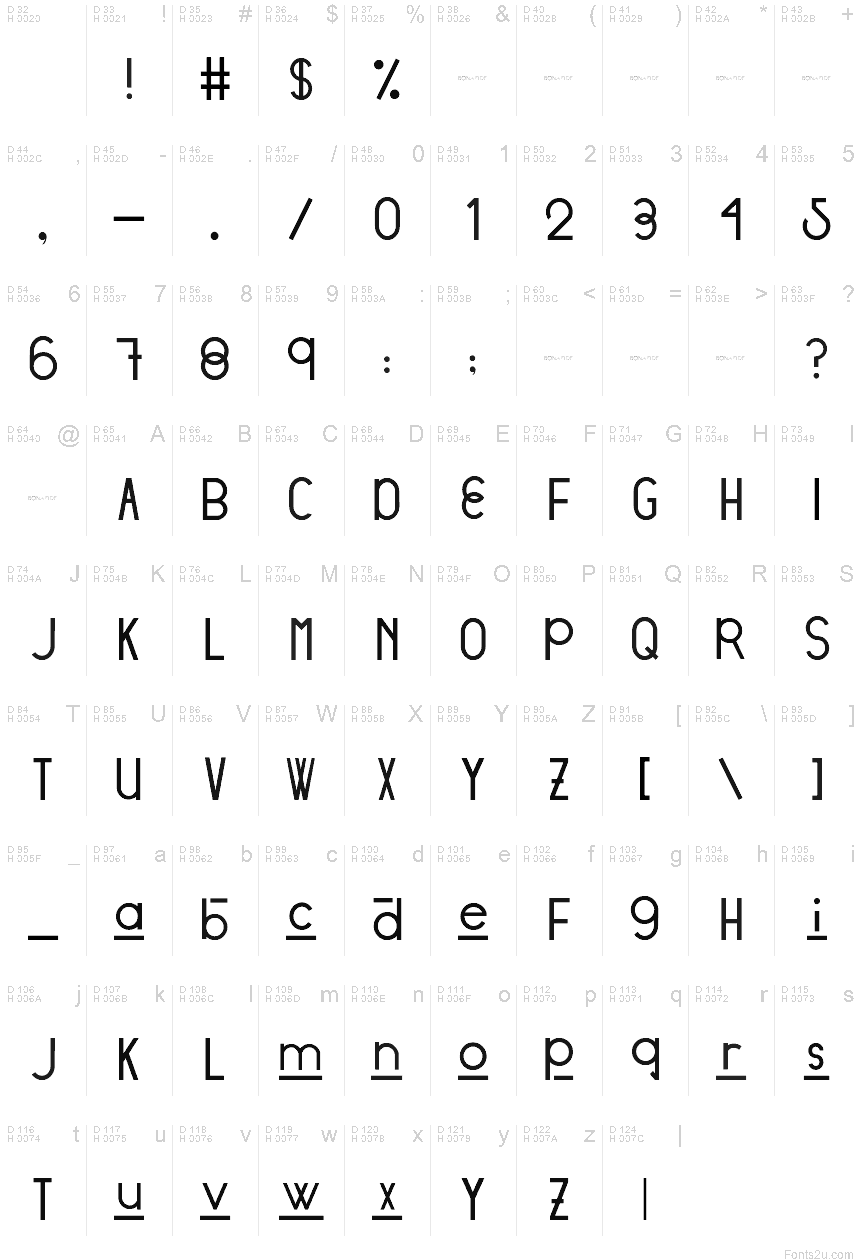
Stratford Sans
TrueTypeDemo
- Euro
Stratford Sans - DEMO.ttf
Tagy
Poznámka autora
DESIGNED BY: Victoria Vandenberg from @BonaFideCraft
The objective of Stratford Sans was to pull from both ends of the spectrum through combining vintage + modern typographic elements to create a font that would seamlessly amalgamate itself into the story of your designs.
Design Process
The initial design process pulled from finding a voice for the city of Stratford, Ontario. The city has a strong scene of traditional arts + culture and is focused on adding digital culture + flair to the mix. The city is expressive, traditional, and unexpected. Therefore, elements tipping a hat to traditional British letterforms and the fluid combination of grotesque era ovals and unforeseen hints of geometric characters are what truly send Stratford Sans into a realm of its own.
The initial design decision was that Stratford Sans would, in fact, be a sans serif font. This is to pull away from its branding of traditional arts and giving it the opportunity to newly define itself, whilst still allowing the magic that is its history, to seep through its characters. Interlacing two conflicting themes gives you the ability to craft a harmony between the two: to pull the exciting and non-negotiable defining elements of each - and defining a new sensation.
Tabulka znaků
Prosím, použijte roletové menu ke shlédnutí různých tabulek znaků obsažených v tomto písmu.

Základní informace o písmu
Informace o autorských právech
Copyright (c) 2018 by Victoria Vandenberg - Bona Fide Craft. All rights reserved.
Rodina písma
Stratford
Podrodina písma
Regular
Jednoznačné označení podrodiny
VictoriaVandenberg-BonaFideCraft: Stratford Sans: 2018
Celý název písma
Stratford Sans
Postscriptový název písma
Stratford Sans
Informace o ochranné značce
Stratford Sans is a trademark of Victoria Vandenberg - Bona Fide Craft.
Výrobce
Victoria Vandenberg - Bona Fide Craft
Designer
Popis
Copyright (c) 2018 by Victoria Vandenberg - Bona Fide Craft. All rights reserved.
Rozšířené informace o písmu
Podporované platformy
PlatformaKódování
UnicodeUnikód 2.0 a následná sémantika, jen BMP Unicode
MacintoshZápadní (roman)
MicrosoftPouze BMP Unicode
Podrobnosti o písmu
Vytvořeno1969-12-31
Revize1
Počet znaků95
Jednotek na Em1000
Práva pro vkládáníVložení povoleno pouze pro shlédnutí a tisk
Rodinná třídaBez klasifikace
VáhaStředně tenké
ŠířkaStředné (normální)
Mac styleTučné
SměrJen znaky směrovány zleva doprava + obsahují neutrály
VzorekNormální
VelikostRůzná