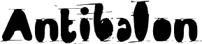
ZookyZooky by Thomas Canale of Canale Studio, Inc. is a free distorted display font with tall, heavy letters and a deliberately fractured finish. Its broad shapes buckle, split, and overlap as if the outlines have slipped out of register. The result feels loud and unruly.
Concert posters are its strongest setting, especially for punk, noise, or experimental acts that suit the damaged contours. Album artwork and skate merchandise can use the same rough collision of solid forms and stray edges. In entertainment graphics, those disruptions evoke bootleg printing, photocopied flyers, and underground music culture.
--
I have worked in typesetting for 30 years. After studying at Cooper School of Art in downtown Cleveland, I joined Peto’s Type House.
At that time, the Cleveland Press still used hot-lead typesetting, while phototypesetting was in its early stages. The Linotronic 5700 was among the leading phototypesetting technologies. At Peto’s, I set headline type on a Typositor, exposing one letter at a time. A headline of approximately 15 words could take one or two hours to complete for paste-up.
This work gave me close-up experience with letterforms and spacing. Ernie Peto also tested me on identifying typefaces by name. I worked there for 18 months.
Setting type has been an occupation and a passion of mine over the last 30 years. After completing some schooling at Cooper School of Art in Downtown Cleveland I accepted a position at Peto's Type House. Back then, the Cleveland Press still set type with 'Hot' lead. I know, I know, this dates me, but the facts are the facts. PhotoType was in it's infancy with the Linotronic 5700 being top-of-the-line technology in Photo type setting. My job at Peto's was more modest, among other things, I was hired to set headline type on what was called a 'Typositor'. It was still photo type setting but for headlines only. Letters had to be set (exposed), one letter at a time. A single headline of lets sayÉ15 words or so could take an hour or two to completely finish for paste-up, that's right, I said paste-up. That should really date me!! By doing this day in and day out (for hours on end) I gained a "close-up' appreciation for letterforms and spacing. Ernie Peto would also quiz me on identifying type by name. It was an interesting 18 months to say the least. There have been lasting effects on my appreciation of letterforms thanks to this experience.
Over the years, there have been spin offs of wood type, Times Roman, Helvetica, etc. Seems to me like we are just going over the same ground over and over and over again. What interests me is not the 'sameness' in the letterforms or their 'invisibility' in the graphics world. Some fonts are used to be 'invisible'. What I mean by this is that they are merely a communication tool to deliver the authors' / writers' message. the artistry in the forms lies in their ability to stay invisible and be easy to read.
But their 'uniqueness' and how that difference translates to the printed page. There are many ways of looking at letterforms. We can look at the beauty of the individual letters themselves. Commenting on the curves of a upper case 'A' or a lower case letterform. Or we can look at them as a 'unit' and how that translates within a block of written text. It is this uniqueness that I am looking for in the fonts I design.
I do look at each individual letterform and revel in the beauty of the forms and lines. But I also want to create a Font that when written out will display some unusual and unexpected characteristics when in a large block of text. Look for different line weights and forms in my font glyphs. The idea here is to allow the printed page to display uniqueness in contrast.
Rozšířené informace o písmu
Podporované platformy
PlatformaKódování
UnicodeUnikód 2.0 a následná sémantika, jen BMP Unicode
MacintoshZápadní (roman)
MicrosoftPouze BMP Unicode
Podrobnosti písma
Vytvořeno2011-08-17
Revize1
Počet glyfů130
Jednotek na em1000
Práva k vloženíVložení povoleno pouze pro shlédnutí a tisk
Třída rodinyBez klasifikace
TloušťkaStředné (normální)
ŠířkaStředné (normální)
Styl MacTučné
SměrJen znaky směrovány zleva doprava + obsahují neutrály